We work with a select few clients who believe in creating something memorable together. If this sounds like you, click the button below to tell us about your project. We read every form submission.
→ Start a project

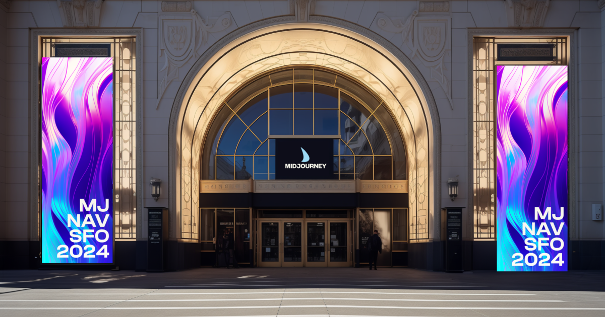
Midjourney has received tremendous press since 2021, yet non-technical audiences are often discouraged by their visual communication. This project positions them to remain competitive in a rapidly growing AI landscape by making the identity more approachable.
The strategy draws from the founder’s quotes and mission statement. Light refraction serves as the central metaphor — symbolizing the expansive creativity their tools make possible. Visual identity colors connect across cultures, ages, and industries, distinguishing Midjourney from the sea of tech-company blue.
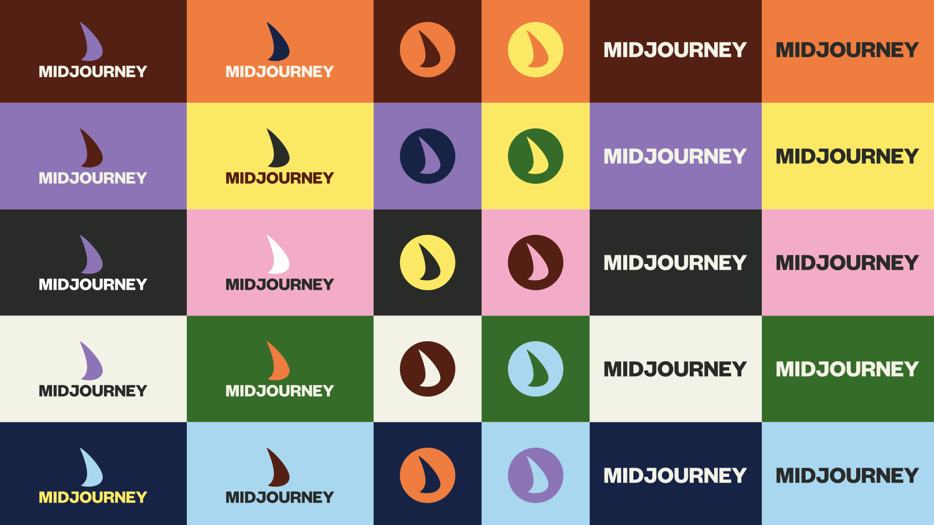
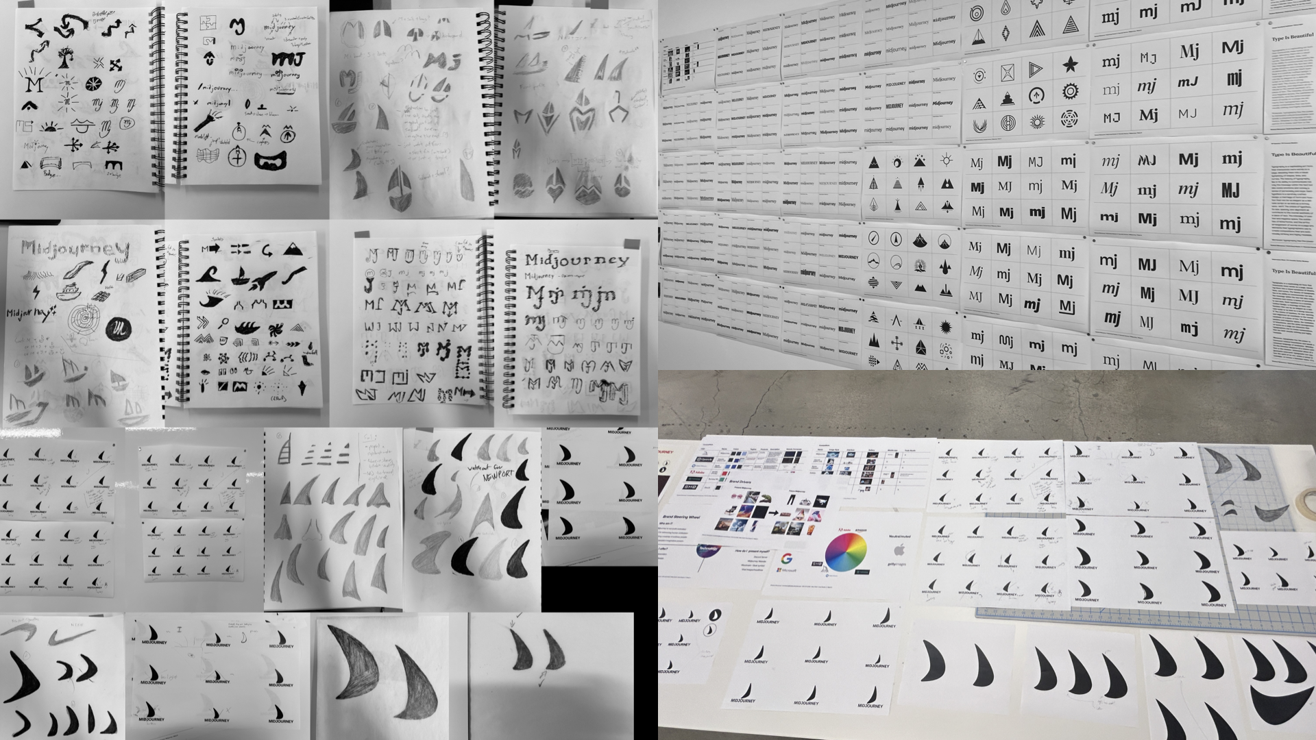
The new logo is an evolution of the previous sailboat symbol — distilled to its simplest abstraction.

The Sail. Through extensive logo exploration, this was the simplest abstraction of their sailboat logo.
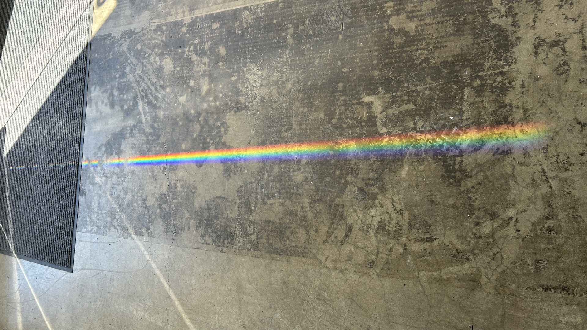
Visual identity colors emerged from light refraction, symbolizing expansive creativity possible with their products.
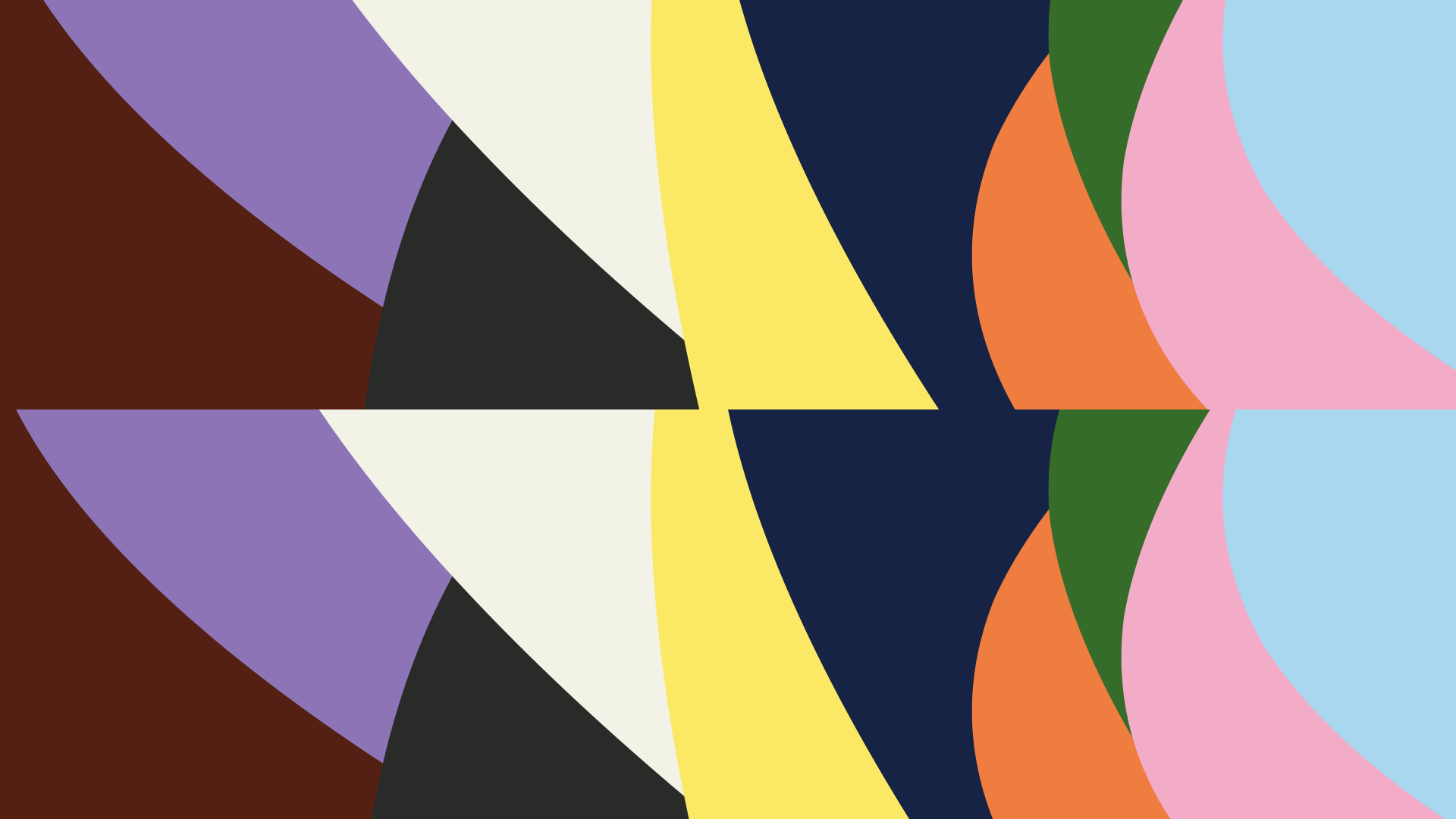
The primary palette helps Midjourney stand out from the majority of tech companies.
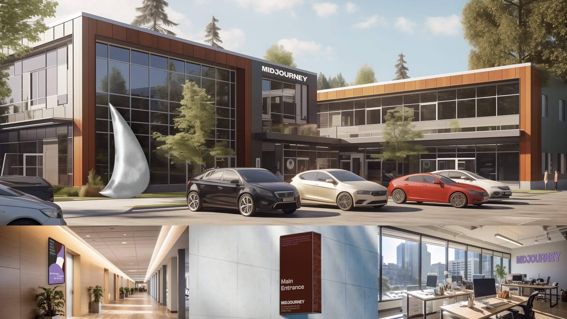
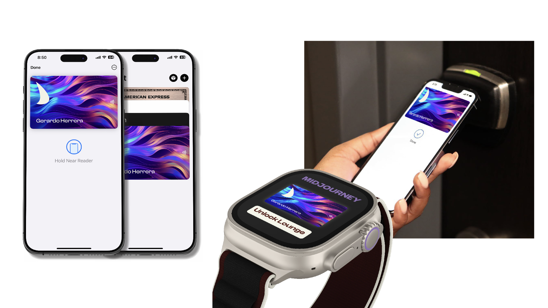
A concept for Midjourney’s first HQ office space, featuring a brushed stainless steel sculpture of the sail outside.
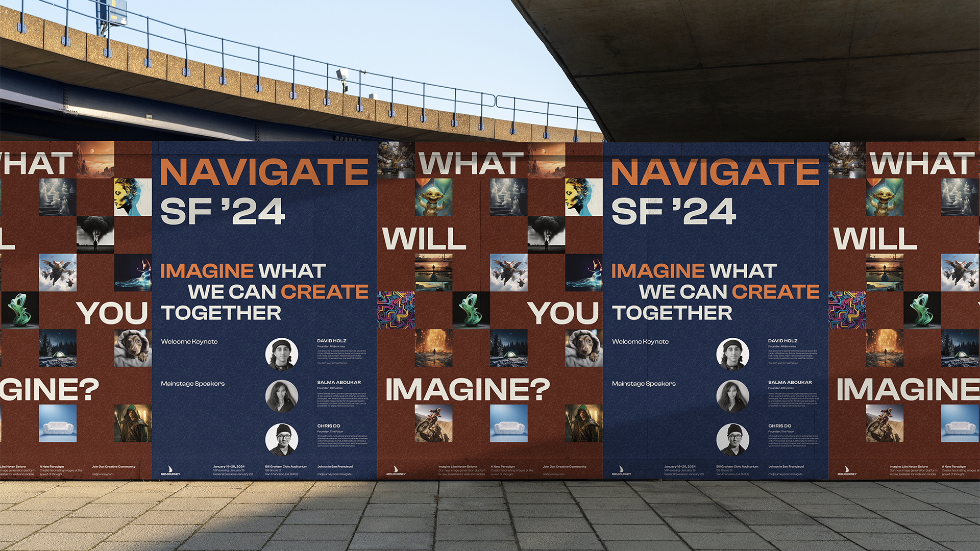
Midjourney Navigate
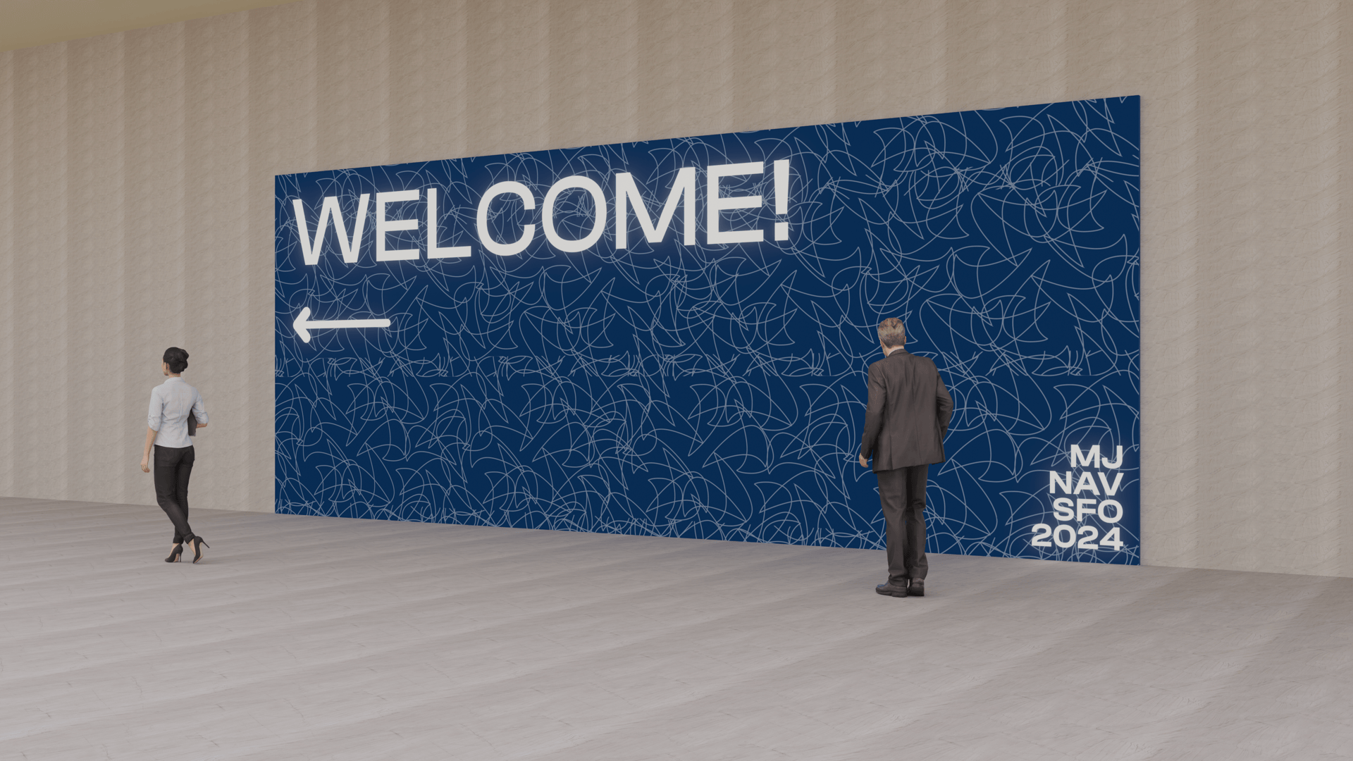
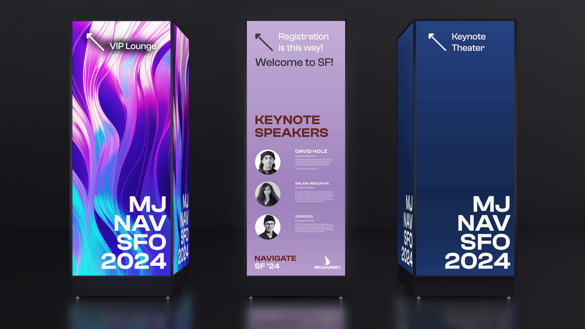
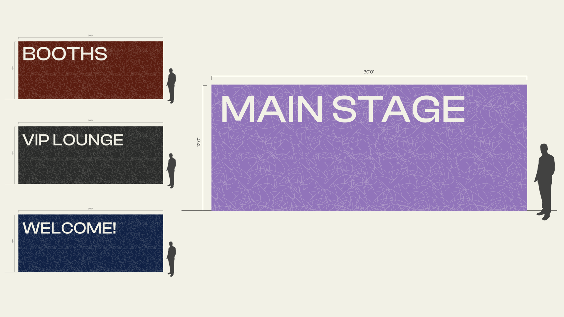
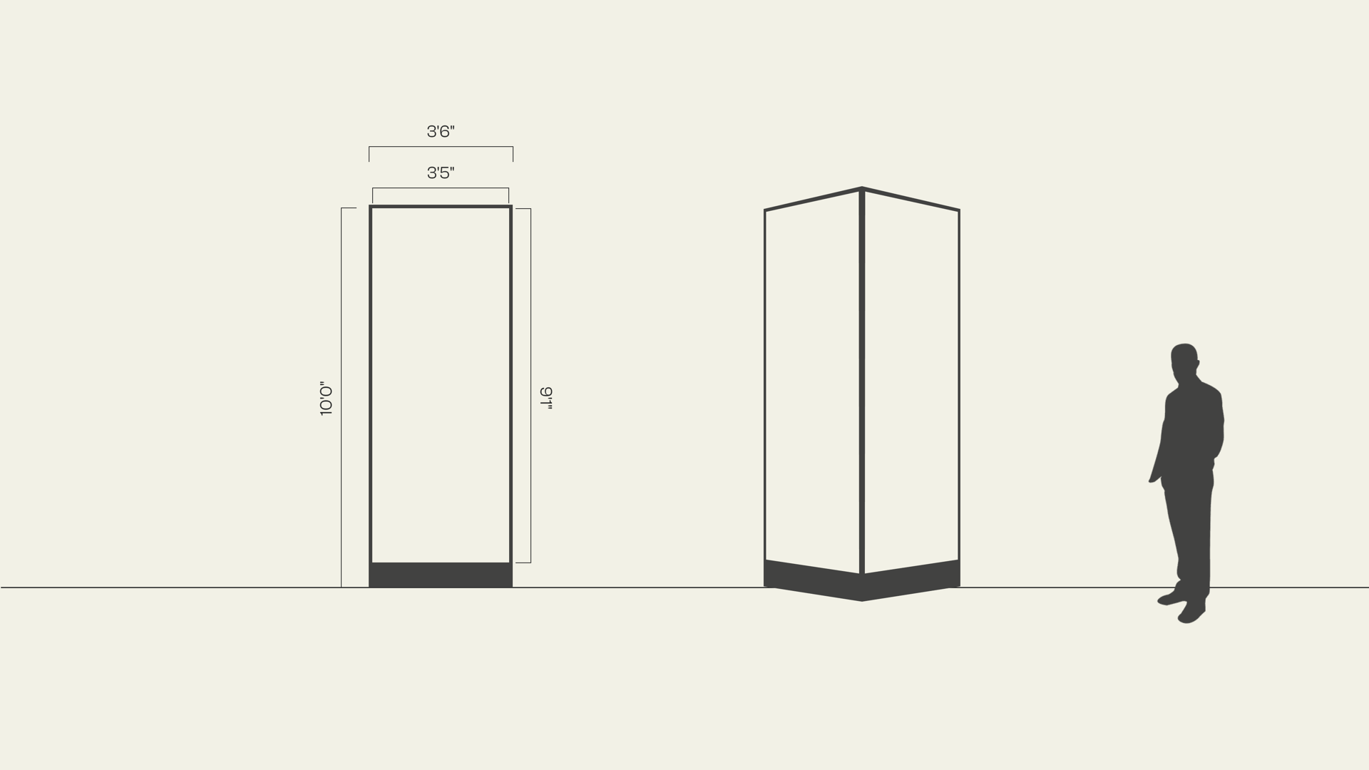
Navigate is a proposed concept for a Midjourney user conference, held in San Francisco.
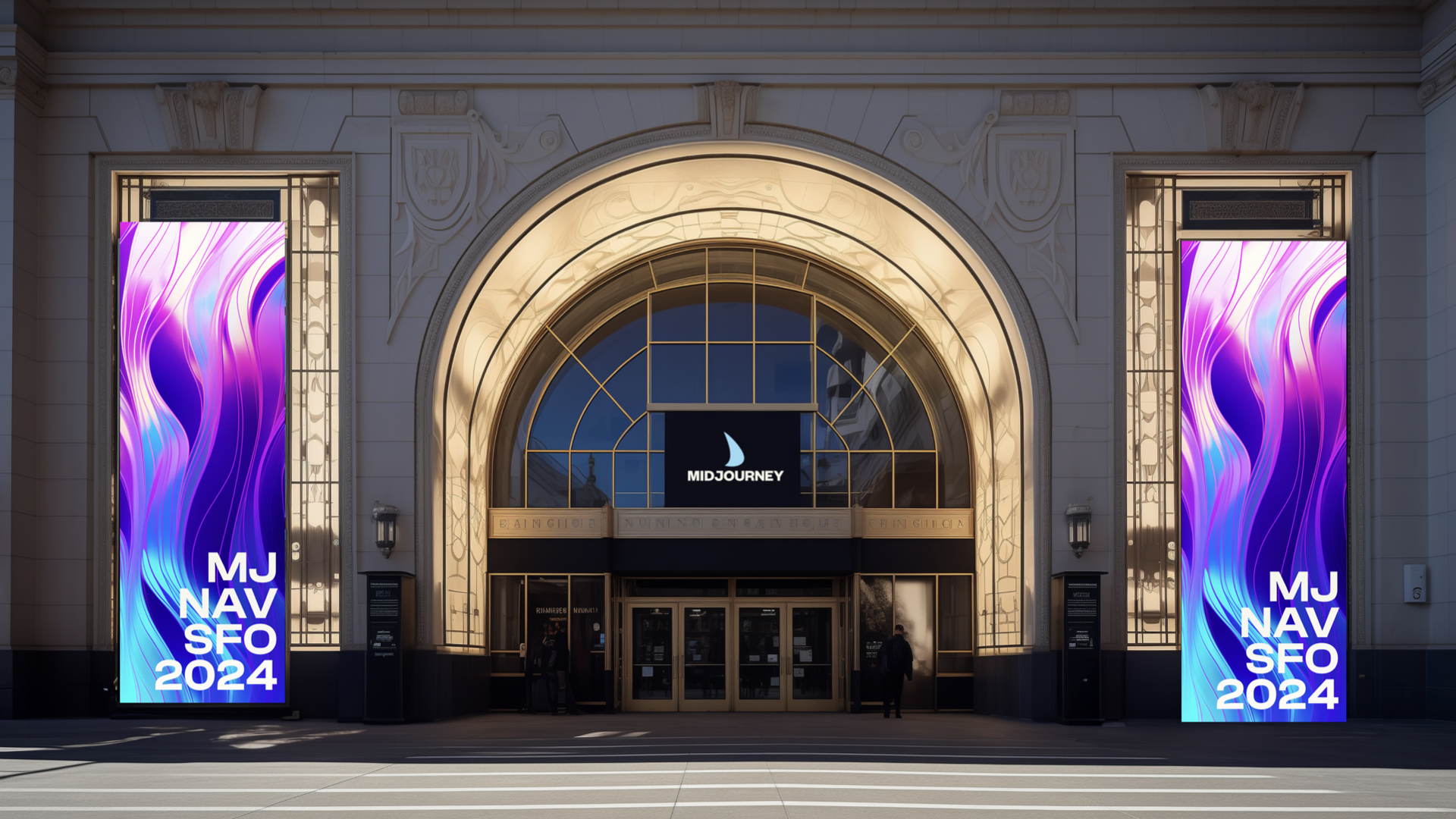
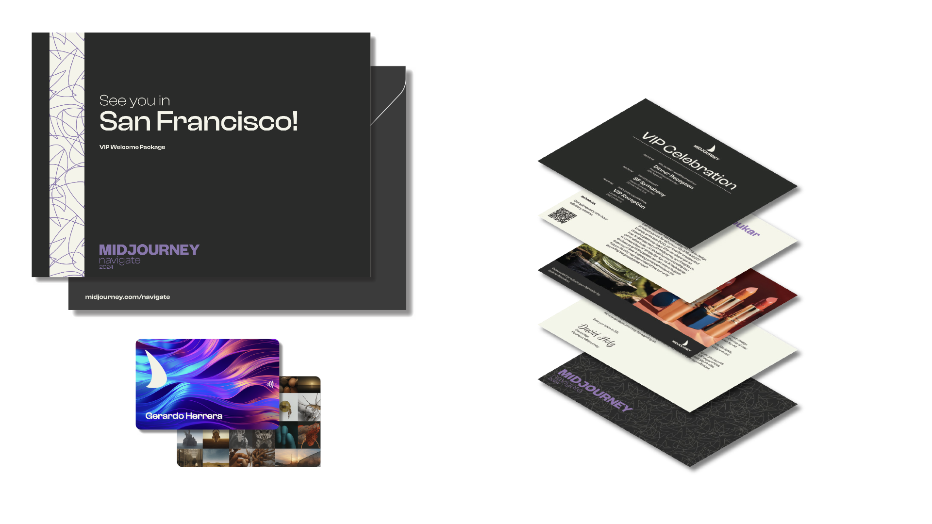
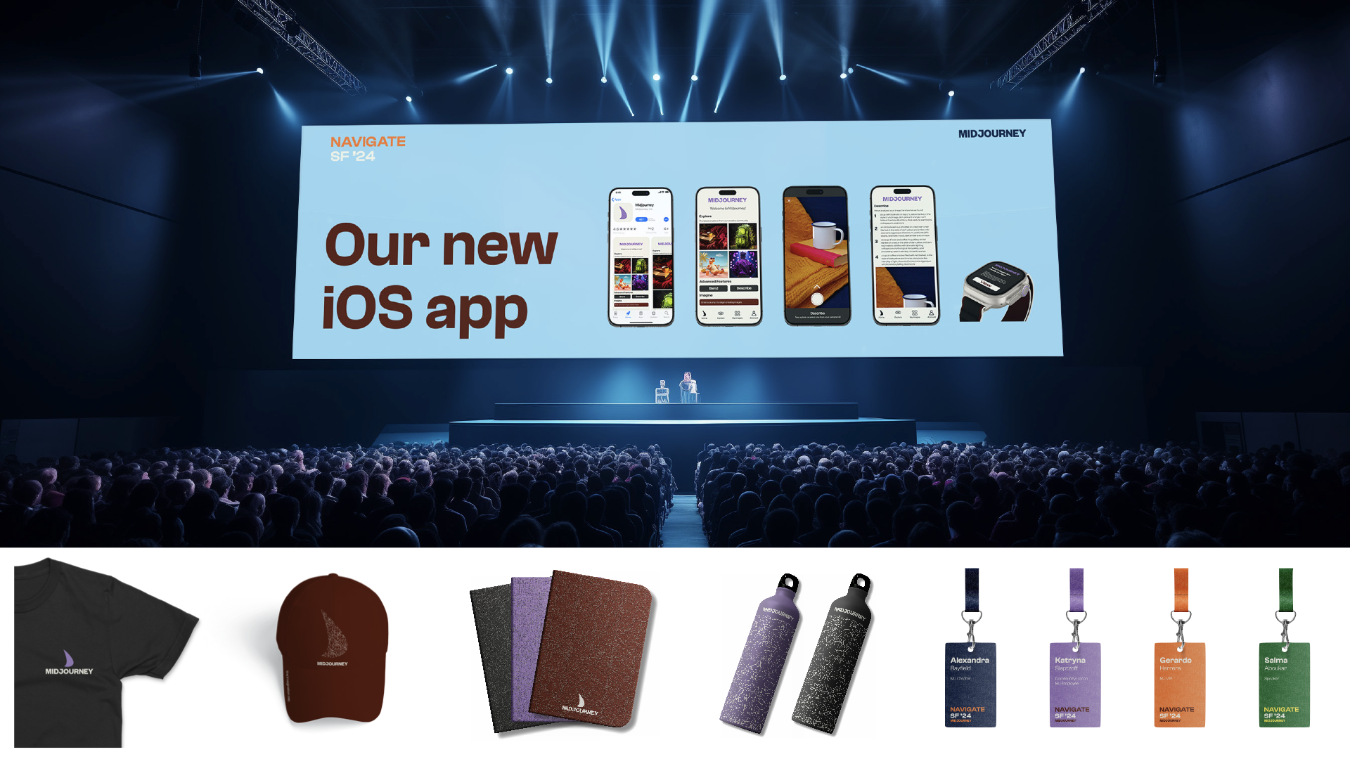
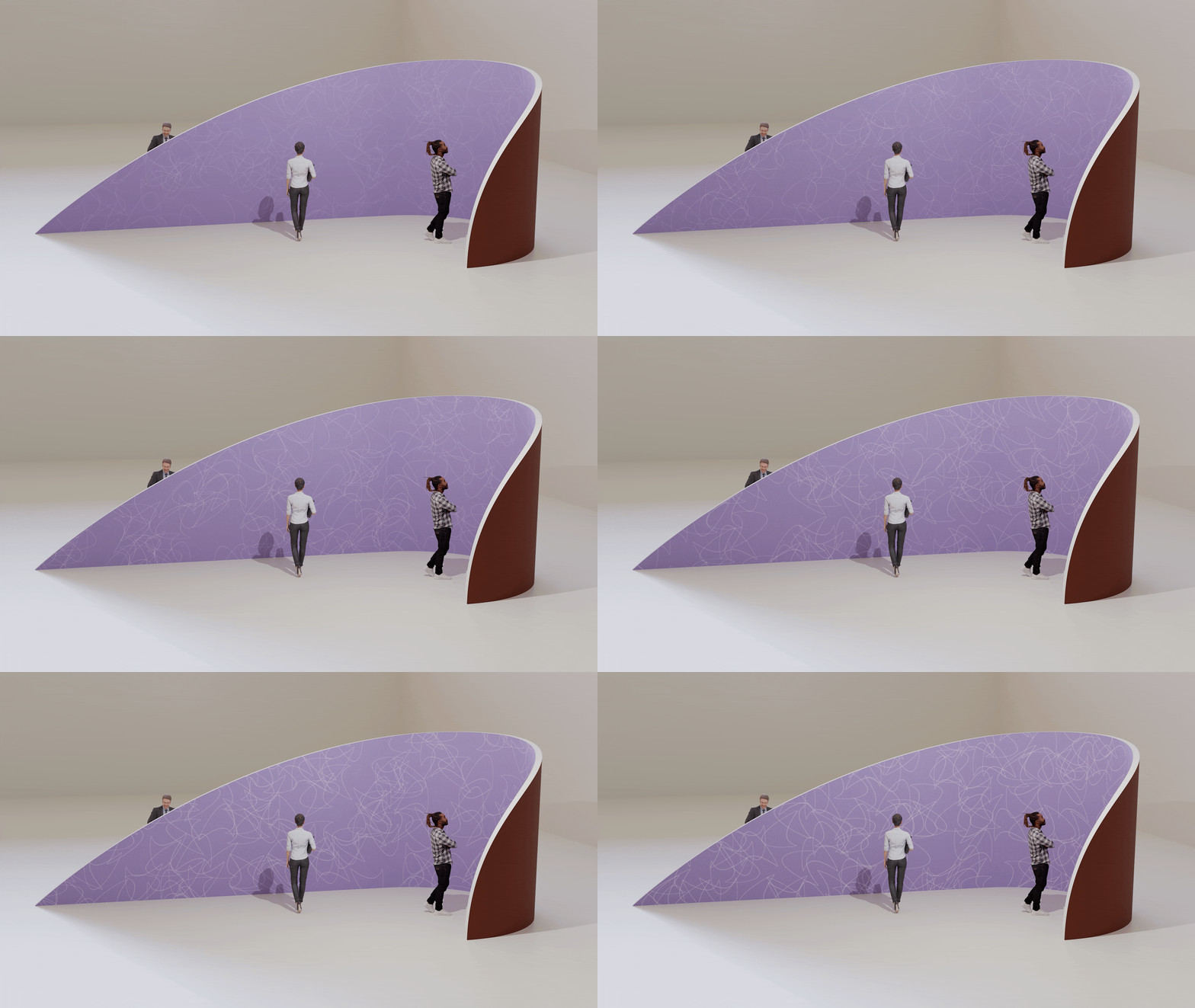
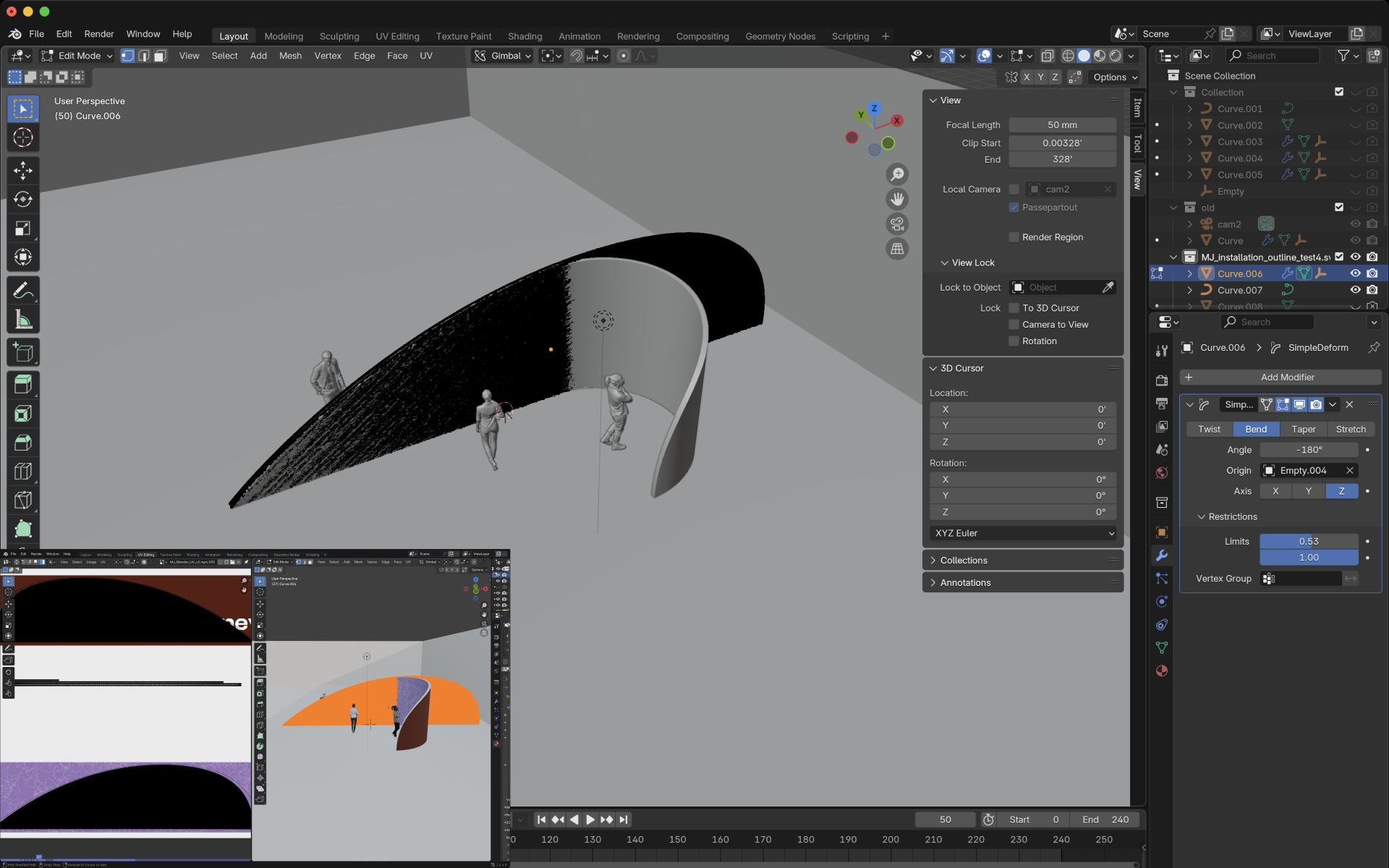
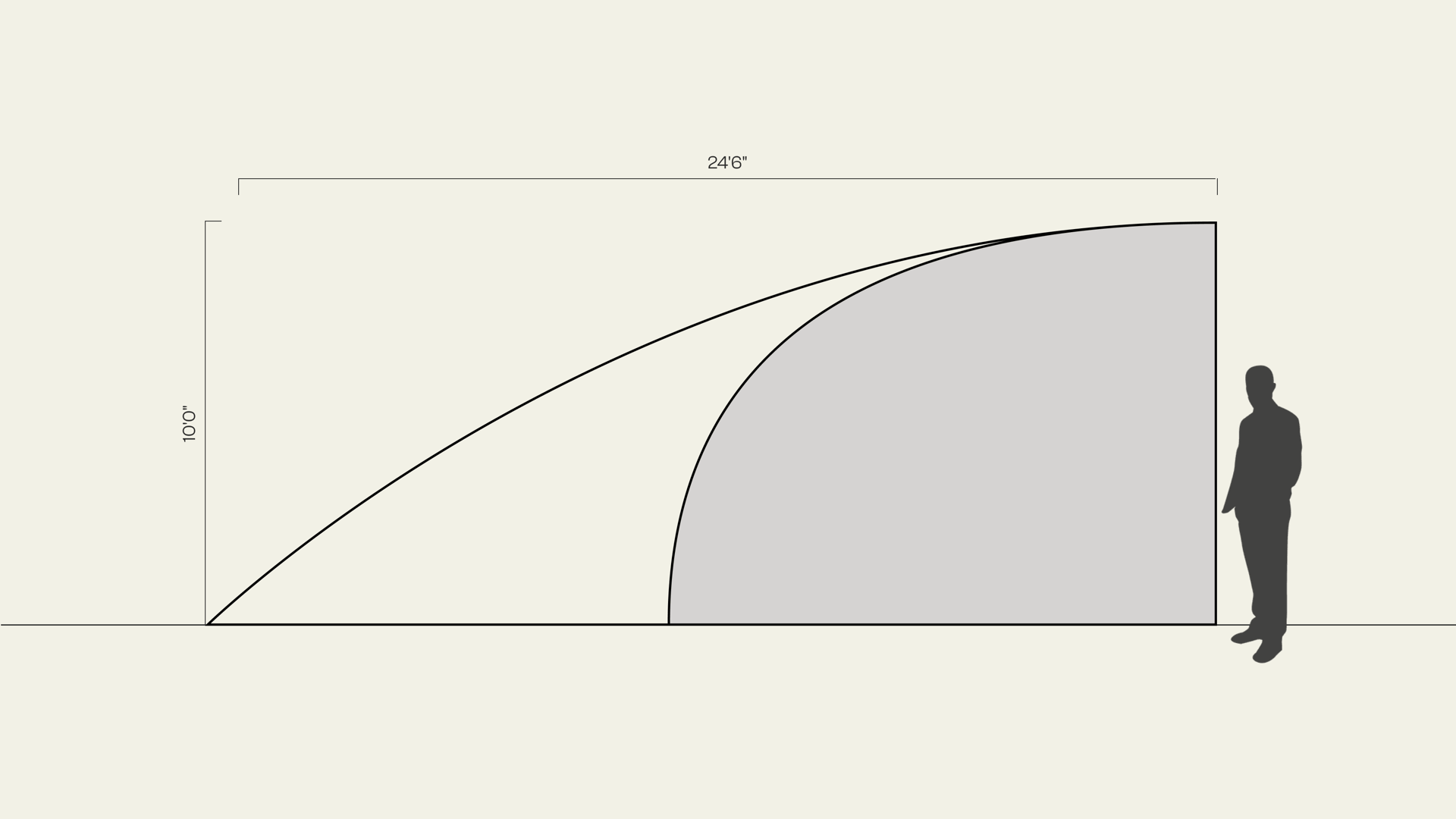
An interactive installation in the shape of the sail symbol — 10ft tall, creating an immersive viewing experience.
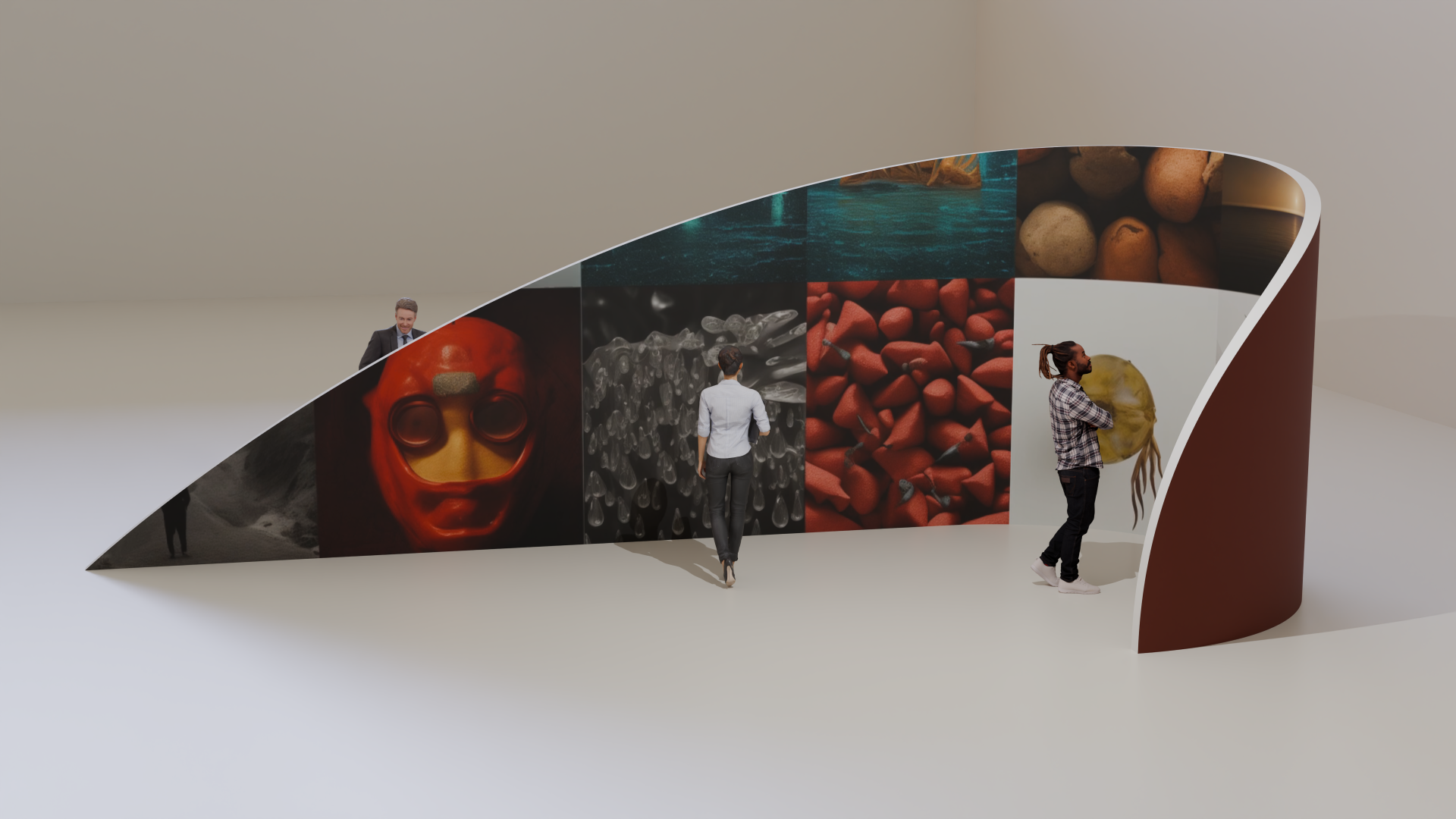
Conference attendees speak generative AI prompts into microphones surrounding the installation in real-time.
Process
We work with a select few clients who believe in creating something memorable together. If this sounds like you, click the button below to tell us about your project. We read every form submission.